Bio
Aralynne is the half sister of Meru, and although the two girls both followed the path of their respective mothers, they are still close and value their familial bond highly.
Like her mother before her, Aralynne decided to follow the path of the Barossa Knights: an all female group of warriors bound by a martial creed of honour.
Unlike her mother though, she is not a swordswoman. Aralynne inherited her father’s Arimarian blood which grants her greater channelling affinity. Depending on whom you ask, this is a blessing or a curse, but in basic terms it has granted her the ability to project fire, and through this ability and a lot of suffering, Aralynne has risen to become a Priestess of the order.
However, Aralynne’s tranquil life was shattered upon receiving a letter informing her that her sister was in peril. She immediately set off to gather support and plan a rescue with Meru’s mother.
Now it’s just a simple matter of attacking a fortress, getting into the dungeon, and finding her sister in time.
About the Art
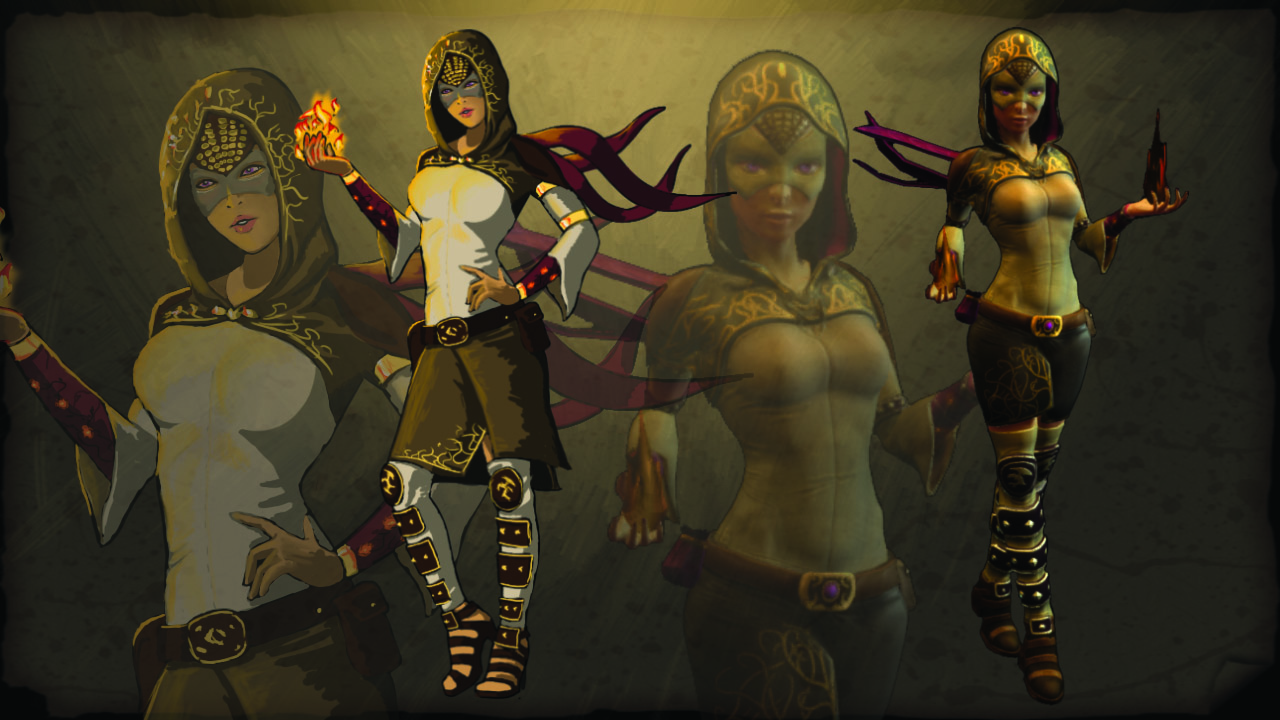
The version posted on here is actually a quick recreation of the original concept art I did. It’s the same style and same line art, but I lost the finished version so I had to quickly recolour it. The original one had more purple. I say the same style, and it is the same style as the original version of this image, but it’s still a different style from the other character concepts. The main reason for that, was that I was messing about. Hope you weren’t expecting something more profound than that explanation.
It’s true that a lot of people have come to expect certain things from concept art, and truth be told, it’s not concept art. A lot of what you see from AAA companies is professional production art made by dedicated art companies. It’s effectively a very pretty lie. I’m not complaining. We all love the lie, and it gives good work to many fantastic artists. All I’m asking is that you don’t expect it from every game. When I’m making concept art I’m doing just that. Conceptualizing. Sometimes that’s a nice painting, sometimes it’s an ugly as sin sketch of something, and sometimes it’s a squishy little person made out of blu-tac or tinfoil. I’m horrendously inconsistent. I have no style or flare, or ‘unique voice’ as they like to call it in artistic circles. I just do stuff, or half do stuff and leave the rest up to interpretation.
Anyway. Back to the character. After this concept was done the character creation stuck pretty close to it. In fact there were only three notable changes. Some of her gold bracelets became studded and leather bound for some unknown reason. I probably hit the wrong thing on the colour picker by accident would be my guess. Her sandals were changed to be boots. Boots seemed more badass… and also need fewer polygons. Her skirt got a little shorter and her stockings longer. A skirt becoming shorter might initially sound like just an attempt to make the character a little sexier, but this change was made for the simple reason that it used fewer bones and would be easier to animate. In other words, laziness.
Overall though, I’m very happy with how the character turned out, even if she does look like a super hero in most team colours.
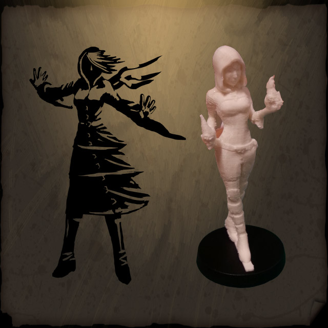
Looking back at the very original squiggle I did for the board game prototype, she’s come a long way. That Orco like triple dress wizard robe thing might have been funky to see. Might have even been worth the character melting in the desert heat.
Talk again in a week’s time, but if you want to see stuff before that, you can follow us on the twitter, facebook, and instagram. All the cool kids are doing it.


